When you’ve been staring at the same set of app icons for nearly seven years, you stop noticing them. They blend into the background—part of the wallpaper of digital life. Word is blue, Excel is green, PowerPoint is red. Click, open, type, close. Routine.
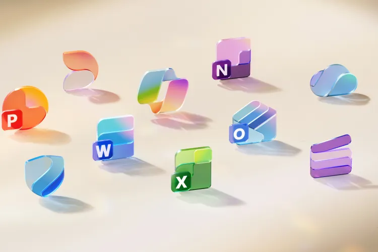
But Microsoft just shook up that routine. This week, the company revealed a fresh set of Office icons, and suddenly the familiar feels… new again. Softer curves, brighter gradients, cleaner shapes. They look friendlier, almost playful, but still professional. It’s a small design change that hints at something bigger: the way Office itself is changing in the age of AI.
Take Word. For years, its icon stacked four bars, like lines of text. The new one pares that back to three. Simpler, sharper, easier to spot when it’s tiny on your phone screen. Excel and PowerPoint have had similar makeovers—vivid gradients instead of flat tones, smoother edges instead of harsh blocks. It’s the same family you’ve known forever, but reimagined for today’s devices, where an app might live on a desktop dock, a tablet, a foldable, or an Apple Vision Pro headset.

Why now? According to Microsoft’s design team, the last big icon refresh in 2018 was about capturing “connection and collaboration.” That still matters—but in 2025, connection doesn’t just mean two people editing the same doc. It means you, your team, and an AI assistant all working side by side. Copilot—the AI brain baked into Microsoft 365—has become such a big part of the suite that its design language actually inspired these new icons. Fluid, vibrant, less rigid—because work itself has become more fluid, vibrant, and less rigid.
It might sound silly to fuss over colors and shapes, but icons matter. They’re the first handshake between you and the software you spend hours with every day. They set a mood. They tell you whether a tool feels trustworthy, old-fashioned, or cutting-edge. Think about the uproar when Google tweaked Gmail’s logo, or when Instagram ditched its skeuomorphic camera. People groaned, then adapted—and now those logos feel inevitable.
Microsoft’s bet is that these new icons will do the same. Over the next few weeks, they’ll roll out across web, desktop, and mobile versions of Microsoft 365. Billions of people will see them. Some will shrug. Some will complain. But eventually, the new Word, Excel, and PowerPoint will feel as familiar as the old ones—just like updating the furniture in a room you’ve lived in for years.
And maybe that’s the real story here. Microsoft isn’t just redecorating. It’s quietly telling us that Office is no longer the dusty box of tools your parents used. It’s evolving, leaning into AI, and reshaping itself to stay relevant in a future where the way we work is shifting faster than ever.
Icons are small. But they carry weight. And with this redesign, Microsoft is whispering something simple: the future of work doesn’t just look different—it feels different too.


